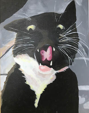
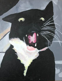
Animal Portrait Acrylic
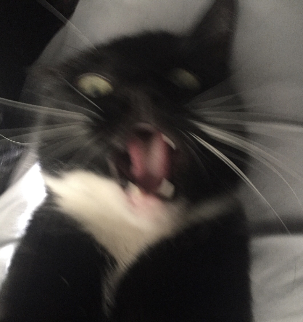
This is a 11x14inch acrylic pet portrait. I did not use a sketch, instead I used a reference picture. The picture I was using was blurry and that's why I chose it. I like abnormal and blurry pictures of animals because it shows you more than just their face it shows motion and emotion. If I were to choose a regular picture of my cat head on of just him sitting how would that be any different than anyone else's? This picture was taken before he bit me and no one knows that which I think makes it funnier because all they see is this picture of a cat with a almost surprised expression on his face.
During the process of this piece I liked it more and more, I think that think I did a good job capturing the look on his face. the most successful part about this piece is the yellow and pink I added into the white part on his chest to create the darker areas. Even though I like this piece a lot o do think I could have done better with the placement of the whiskers and how many I put. The left side of his face has a good amount and I think they look really nice where they are but the other side I think filled up his cheek too much and kept them in almost a straight line of just whiskers. His whiskers on his eyebrows are good and look realistic. If I went back and redid this piece I would try and study the reference more because I think I missed a lot of the values in this piece and kept me away from reaching the realism I was aspiring to get while working on this piece. I defiantly like working with animals and I think I am going to keep working with them.
During the process of this piece I liked it more and more, I think that think I did a good job capturing the look on his face. the most successful part about this piece is the yellow and pink I added into the white part on his chest to create the darker areas. Even though I like this piece a lot o do think I could have done better with the placement of the whiskers and how many I put. The left side of his face has a good amount and I think they look really nice where they are but the other side I think filled up his cheek too much and kept them in almost a straight line of just whiskers. His whiskers on his eyebrows are good and look realistic. If I went back and redid this piece I would try and study the reference more because I think I missed a lot of the values in this piece and kept me away from reaching the realism I was aspiring to get while working on this piece. I defiantly like working with animals and I think I am going to keep working with them.
Final Piece
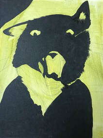
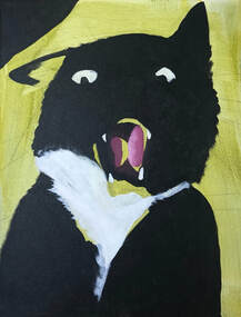
Progress Pictures
|
|
|
|
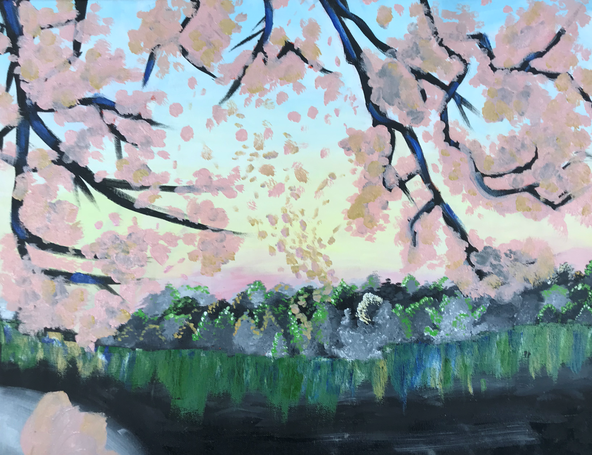
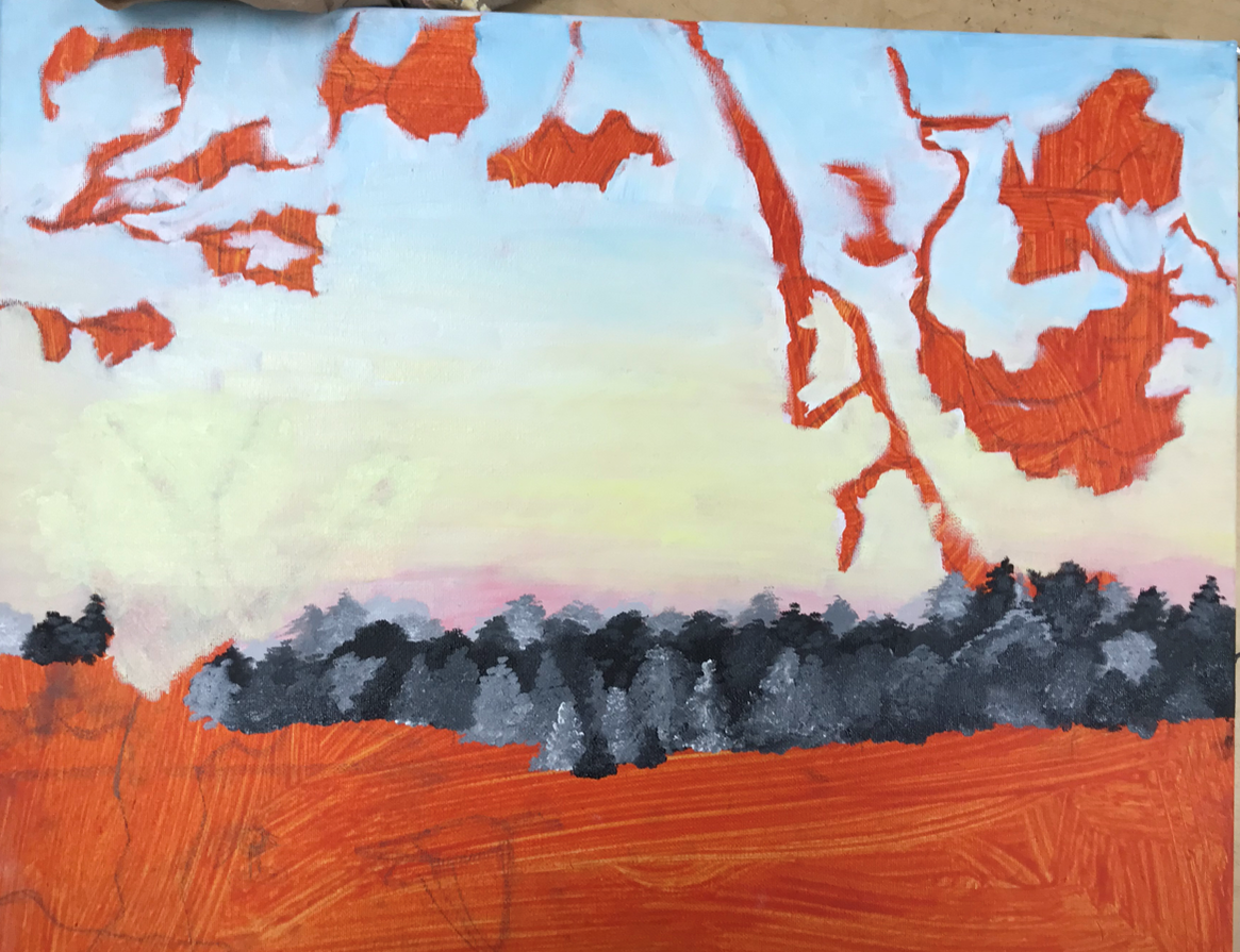
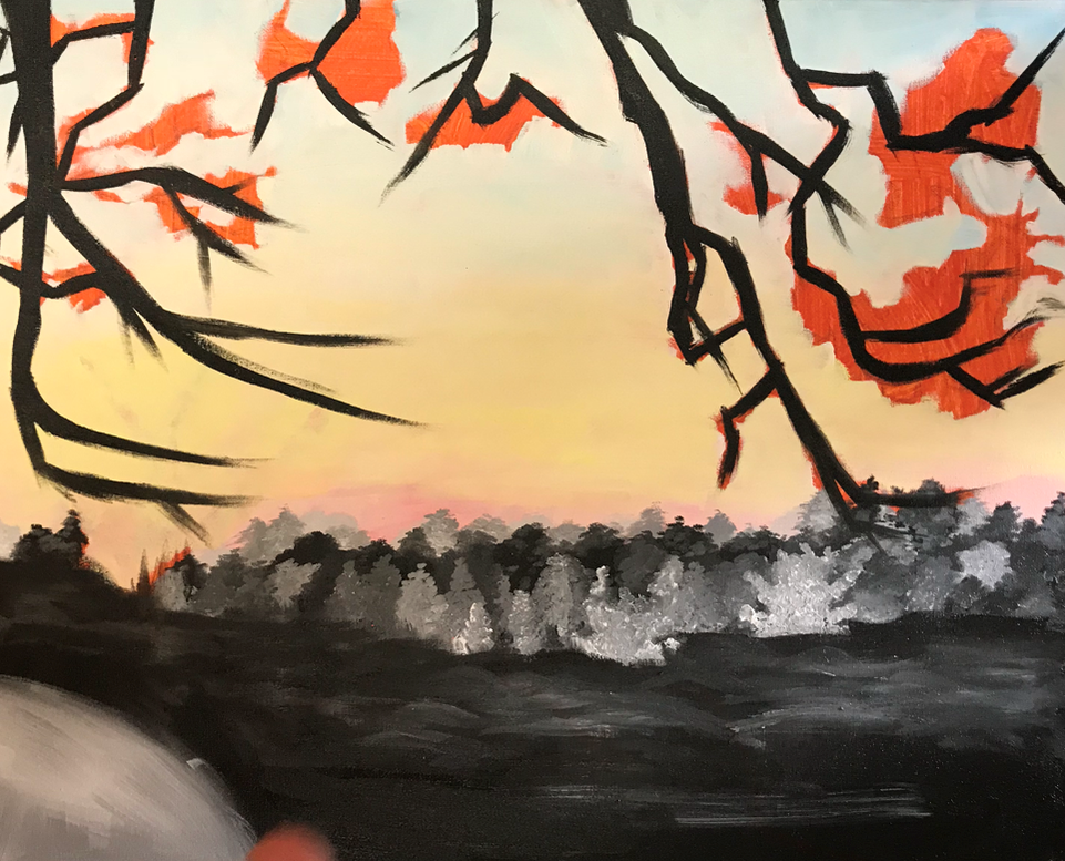
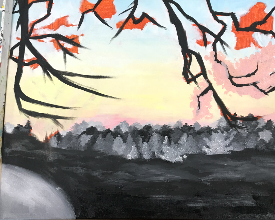
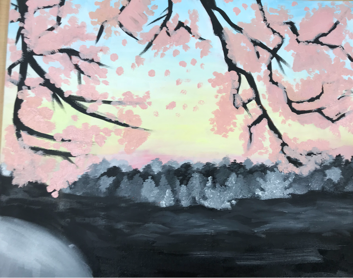
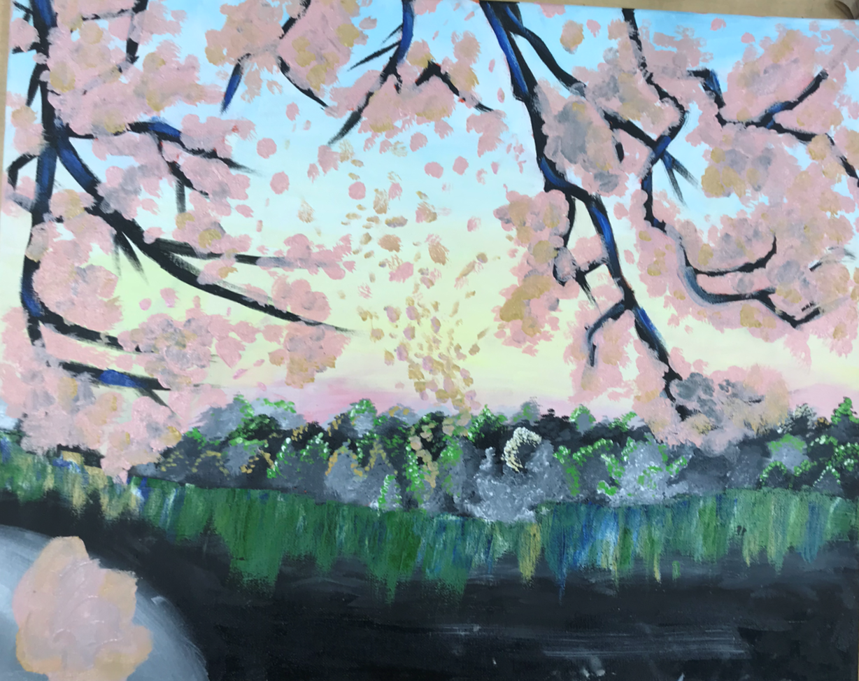
Landscape Oil
This piece is very rushed I think that the colors on the top half of the painting is really nice but when you get to the bottom of the painting you start to get stuck on the dark colors I used. I wanted to have really heavy contrast in this piece and keep it simple but I thin for that to be pulled of I could have taken more time to do it because I rushed this painting and it shows. Going back I would redo the tree like to lighten it up more and add more detail to the flowers on the tree on top. In the foreground there is this rock that is supposed to have a flower on it but I did not finish it. I think there is a lot of things I could have added to this piece so maybe in the future I can go back and fix the mistakes that I made while working on this piece. The things I think I did well on was the texture in the trees in the background I think I could have used more of a variety of colors on them instead of using the same green on one tree, in the flowers on top the pinks and oranges I used look so soft and pretty against the blue sky. If looking at all my pieces together I think this one would stand out as the least impressive piece.
Final Piece
Progress Pictures
|
|
|
|
|
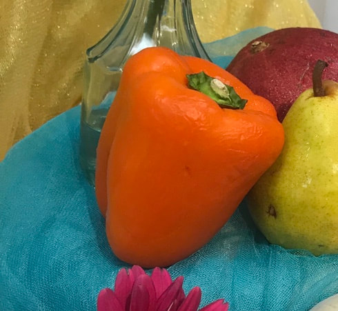
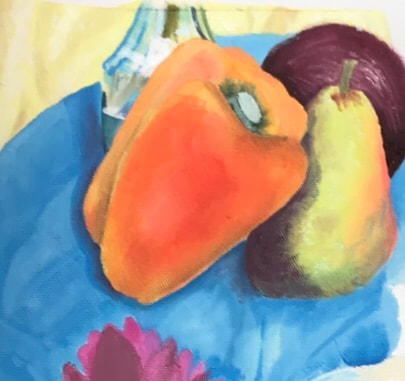
Still Life Oil
This was a practice/project where we did a oil painting of a still life of fruit flowers and fabric. We had to work on finding undertones, shadows and textures.
|
|
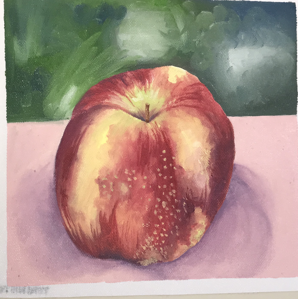
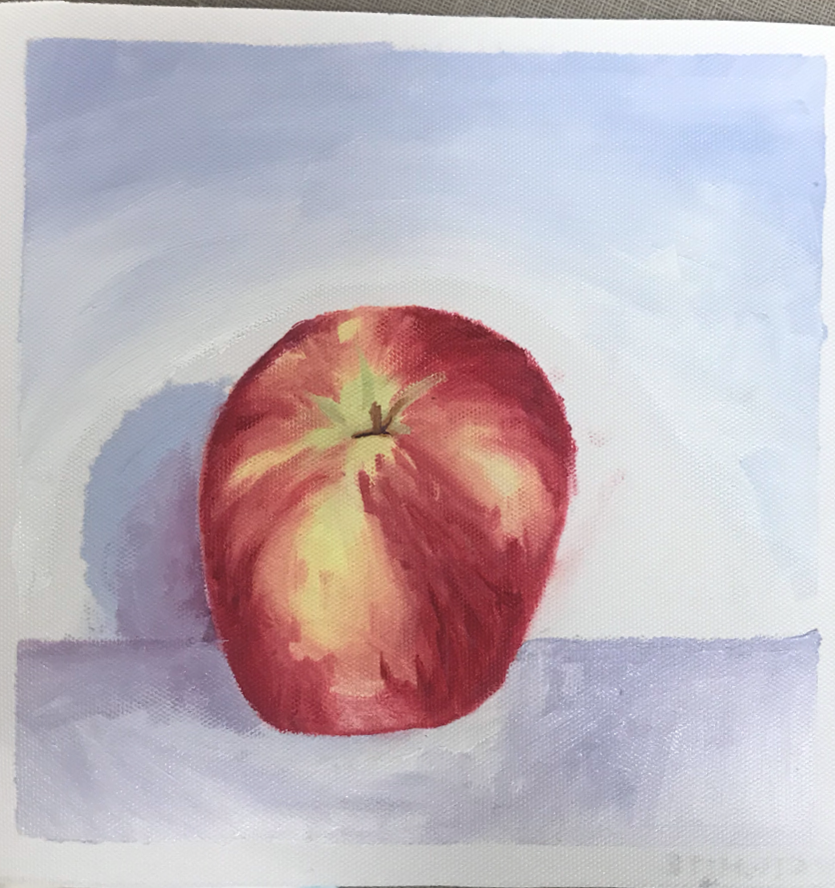
Oil Paint Fruit Practice
In this practice we were introduced to oil paints and we had to do a still life of fruit and I was given and apple. Our first one was with a paintbrush and the second was with a pallet knife. We had to match tone and undertones in the skin of the apple and work on shadows and value.
|
|
Hundertwasser/Klimt Project
Hundertwasser
Friedensreich Hundertwasser, born December 15, 1928 in Austria then later moved to New Zealand and became an artist and an architect. Hundertwasser developed artistic skills and spent three months at the Academy of Fin Arts in Vienna after World War II.
Gustav Klimt
Klimt, born on July 14, 1862, was also an Austrian Symbolist painter and one of the most prominent members of the vienna secession movement. His primary subject was the female body. Klimt was very influenced by Japanese are and the methods involved. His work was the subject of controversy, but he still continues his work. He died on February 6, 1918.
Evaluation
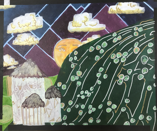
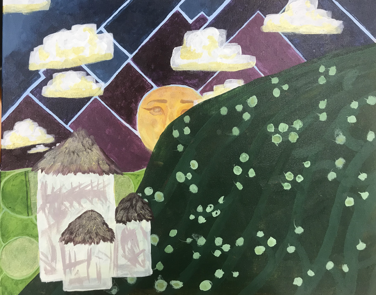
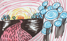
In this piece we had to recreate the Hundertwasser style with a landscape piece, simplifying shapes we saw in the photos and putting them in the piece. I found this piece to be very challenging because it was in a style that i am not familiar with. His style also has lots of bright deep colors making his style seem like a child's art. My mistake with this piece was assuming it would be easy to copy his style, because i am so unfamiliar with this style it was hard for me to make it look like his. I am so used to making my pieces look so realistic it's hard not to make pieces like that. i do like a lot of things about my piece my favorite being the sky. I like all the rectangular shapes of top of the blue and the clouds above it. The gold in the piece is also very pretty and is such a weird element to add to a piece. This helped me grow as an artist because it made me open up to other styles other than my own it has showed me that i should practice other styles so that my ability to do a piece just how i want it in another style or just different in the future. Looking back at another piece that I did inspired by another artists style I also realize that I am just not good at capturing their style. This project has once again taught me that if I am going to explore other styles I need to have a plan because I don't know how to wing a style that isn't mine.
Final Artwork
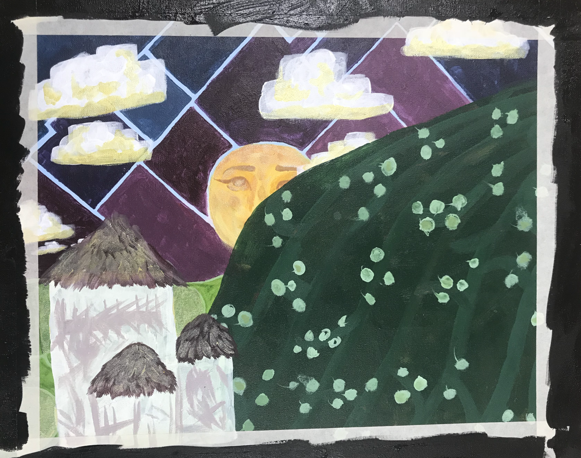
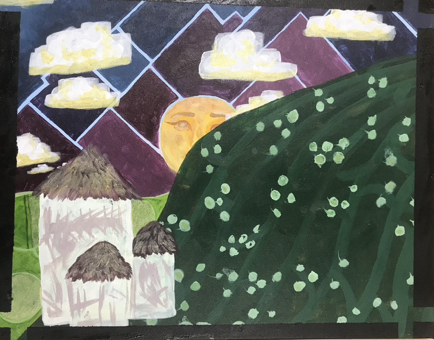
Progress Photos
|
|
|
|
|
|
|
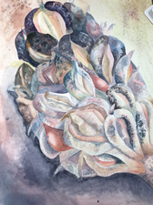
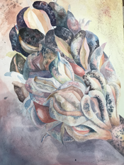
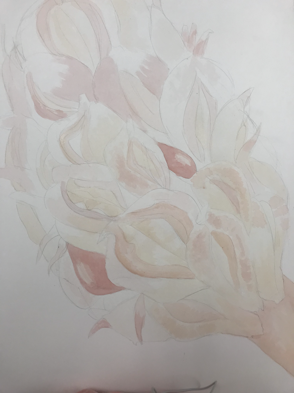
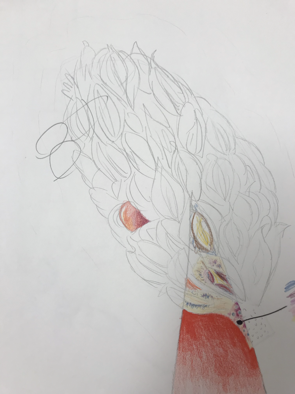
Nature Water Color Project Final
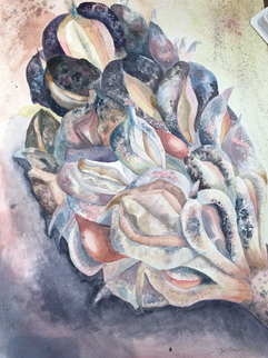
Looking through the pictures i had on my phone this image really caught my eye with the colors and i liked how even though most of the colors in it were very neutral there were these little seeds in it that are bright red/pink so i wanted to add more colors than nature includes. I liked the textures and the subtle value changes through the piece. It was difficult for me to get the contrast between the different shades because there are very light and very light parts of this piece and getting those colors with watercolor paint is difficult. The transition between the different shades are very dramatic and i wish that they were more subtle because that's the feel that i want this piece to have, subtle. The colors in this piece are for the most part very soft and pastel but some other colors are brighter and deeper colors. Going through so many light layers and still keeping the colors light was difficult because if the paint was a little too dark it would cover up all the layers i had just done underneath so that was a bit stressful towards the end. For this being one of the first watercolor pieces i have ever done i am very proud of myself. I like this piece a lot and i didnt know that i was capable of creating such a good piece with water color paint. I really like this medium because i like how easily i can manipulate a color. I didn't struggle to make any color i was looking for unlike acrylic paint which i think personally is a bit more difficult to get the exact color you want especially pastel colors. I don't have a whole lot of water color paintings to reflect on except for a piece i have at my house which is a painting of my cat, in that painting i used very dark and bright colors and didn't do too many layers unlike this piece which shows all the layers of color in the piece. This piece has really showed me what i'm capable of when i take my time and really commit. My favorite part about this painting is when you're far away you cant see all the colors and layers but when you are close up there is so much to look at in every part of it, so many colors and designs in it. At the same time It could look a little more finished if I had added to the top more where the colors get more dramatic.
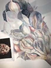
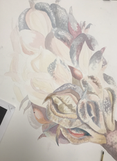
Nature Water Color Progress Photos
|
|
|
|
|
|
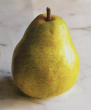
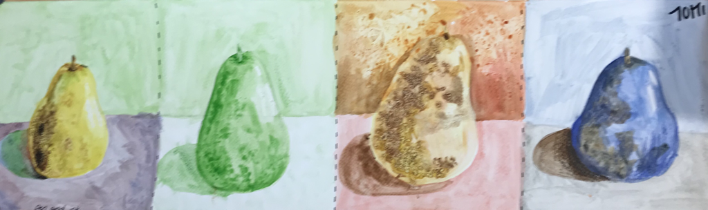
Water color fruit practice
What we were trying to learn with this practice was how to get the color, texture, and shadow that we want for the style. I decided to do was choice or color with resistance, monochromatic, warm colors with salt and plastic wrap, and choice of colors with traditional colored pencils. This practice really helped me get the right color and shading that i wanted. i think that my first pear with the choice of color and resistance was my best style.
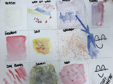
Water color practice
|
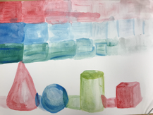
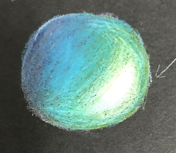
We did three different practices in class. the first was a singular 3-D sphere i used one color to create it. i used layers to create shadows on and next to it. The others have multiple colors. We did different water color techniques on a piece of paper and names them. Last we did a value table where we layered colors to create dark to light of the same color then did 3-D figures on the bottom each a different color.
|
|
|
|
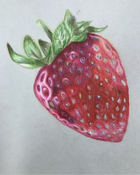
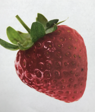
Color blending practice
We did this practice to learn how to blend different colors. We used Prisma colors because when using them you have to layer to blend the colors which is much like painting. These lessons also taught us to find the hidden colors in images like the undertones. We did that by recreating a reference image which was either a colorful fruit or vegetable with texture. My fruit was a strawberry.
|
|
|
|
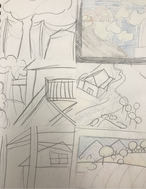
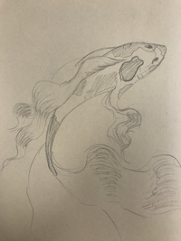
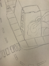
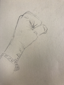
Assessment pictures
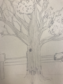
In this practice we made a animal, tree, one point perspective street, and a hand from memory.
|
|
|
|
