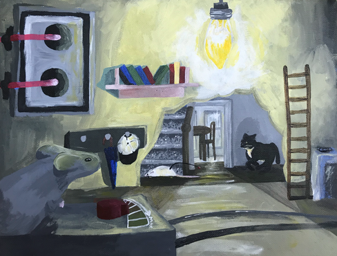
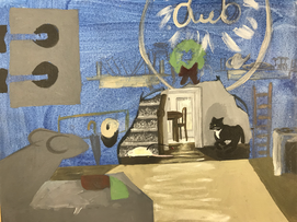
Nature/Mechanical Acrylic
This is my 11x14in acrylic piece that takes place inside a wall looking out into a house. Inside the hole there is a personified mouse with books, cloths, kitchen appliances and remote control controlling a fake rat which the cat is chasing. I had issues with this painting because I have not worked with a lot of different types of lighting so having the singular dull light bulb inside the wall along with the light from the window in the kitchen was hard to paint. I didn't use any reference pictures so this is all from what I have seen before so I don't think that the lighting is as accurate as it could be but considering that I haven't done something like this before I think I did a pretty good job. I think I could have done better creating realistic proportions in the fake mouse for example I think that the head is too small. The perspective is really good though just looking at the mouse in the foreground compared to the cat then to the kitchen I think there is a lot of depth in this painting it even takes you out the window to silhouettes of trees and the sun. I think I could have added more detail to inside the wall it all looks very boring to me and I used very generic colors instead of creating a color scheme and sticking with it I kind of picked random colors as I went and I think that defiantly swayed the look of the piece as a whole. All together I think that the piece is good but unfinished I have made other pieces in the past that have looked way better. This idea I had for nature mechanical had way more potential and is a solid idea and I can defiantly explore this idea again and try again or go back and fix the painting.
Final Piece
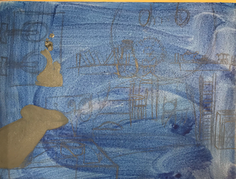
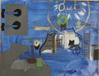
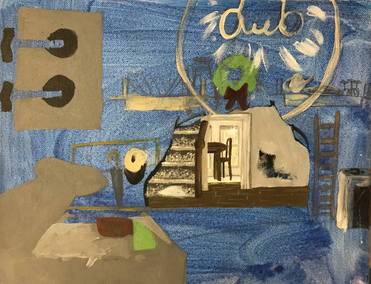
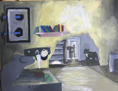
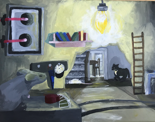
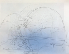
Progress Pictures
|
|
|
|
|
|
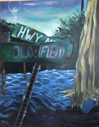
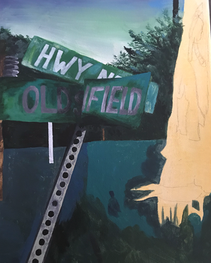
Landscape Acrylic
This is an 11x14 inch Acrylic landscape piece. This piece has become one of my favorite pieces I have ever done I love the perspective I added with the sign and greens in the foreground. I combined two different pictures, one from the lake and the other from a street. I took the water and tree from the lake picture and the sky, tree line, sign and greens from the street picture. I had trouble painting the water because I have never painted or drawn water so it took some time to figure it out I don't think that the texture of the water is consistent through out the piece but I think considering this is my first time I think I did good with the lighting and placement of the waves. The lighting in general in good and there is a lot of depth and value in this piece. What I could have done better is put more color in the trees just to brighten up the highlights and bring more attention to them.
Final Piece
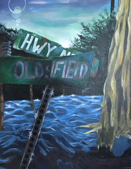
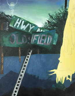
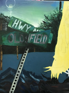
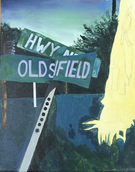
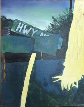
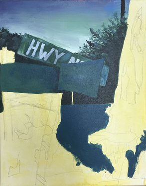
Progress Pictures
|
|
|
|
|
|
|
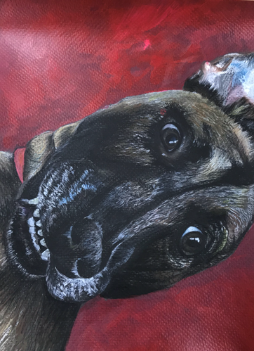
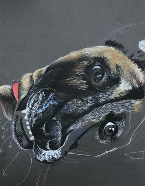
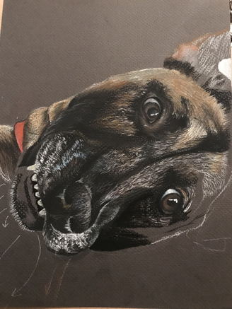
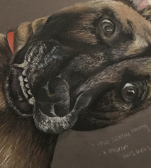
Animal Portrait Pastel Chalk
This is a 8.5x11 inch Pastel chalk pet portrait of my dog Tomi. I decided to do this picture because it is one of my favorite pictures of my dog and I was to lean more towards abnormal angles and facial expressions in animals. I find it very amusing and helpful, I find it helpful because it takes you away from the basics and allows you to focus on the shapes and angles that are actually making up the picture instead of basing it off of every other picture that you have seen. I did not struggle with this piece too much I am new to drawing fur so yes, that was a challenge but eventually it became very easy after drawing it for a few minutes. I think I could have done a better job with value change in the piece and I made the background pure red which I don't regret but I am trying to work on making background realistic and full. So when I painted the background red it was lazy because I want to get away from the habit of just using a solid color.
Final Piece
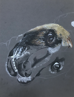
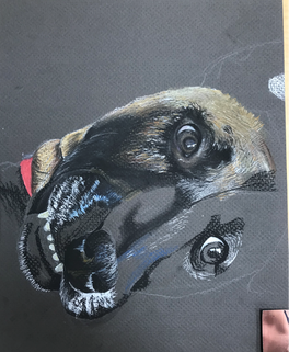
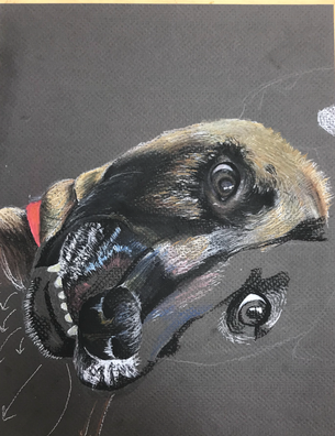
Progress Pictures
|
|
|
|
|
|
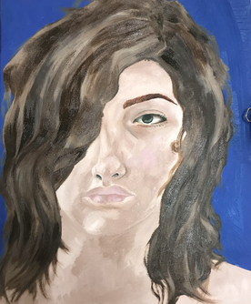
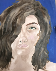
Self Portrait Oil
This piece is a 16x20 inch oil paint self portrait. I tried to keep of the cooler side with all the colors including the browns in my hair and the flesh color in the skin. Creating this painting was not as big of a struggle than I had originally thought, I am experienced in human portraits so I am used to figuring out the proportions and how to find the undertones in the skin. The issue that I was expecting to come across is the size of the piece because I don't usually work with bigger canvases so I am not as comfortable with this size as to some of my other pieces where I worked with smaller canvases like my acrylic landscape. I did not have any problems with the size because it helped me look at the picture almost closer because I filled it up. I do think that this piece is exceptional but I can still see other problems with it. I have never done a self portrait nor have I ever done a portrait in oil paint before so yes this was challenging yet I still had higher expectations for myself. I do think that this piece was a success but not as successful as it could have been for example I don't think that the shape or color of the hair fits the rest of my face I think that there is too much contrast between the hair and the skin on my face, I need more o fa cooler brown in my eye brows because that is the only warm element in my piece which makes it stand out. I was starting off good with the eye then I think I began to panic because I was rushing due to the dead line. I think that if I took this piece home to work on it so that I wouldn't be so rushed it would have come out better in the end.
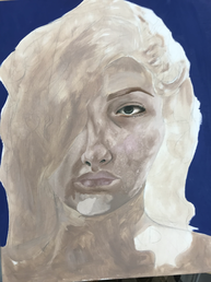
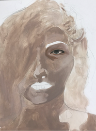
Final Piece
Progress Pictures
|
|
|
|
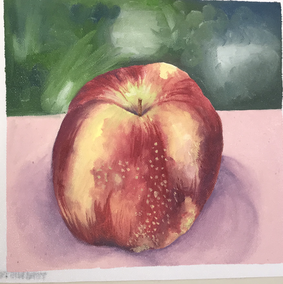
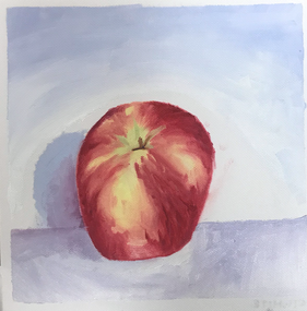
Oil Paint Fruit Practice
In this practice we were introduced to oil paints and we had to do a still life of fruit and I was given and apple. Our first one was with a paintbrush and the second was with a pallet knife. We had to match tone and undertones in the skin of the apple and work on shadows and value.
|
|
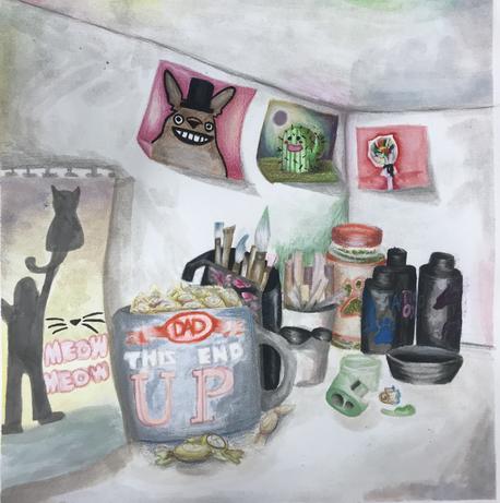
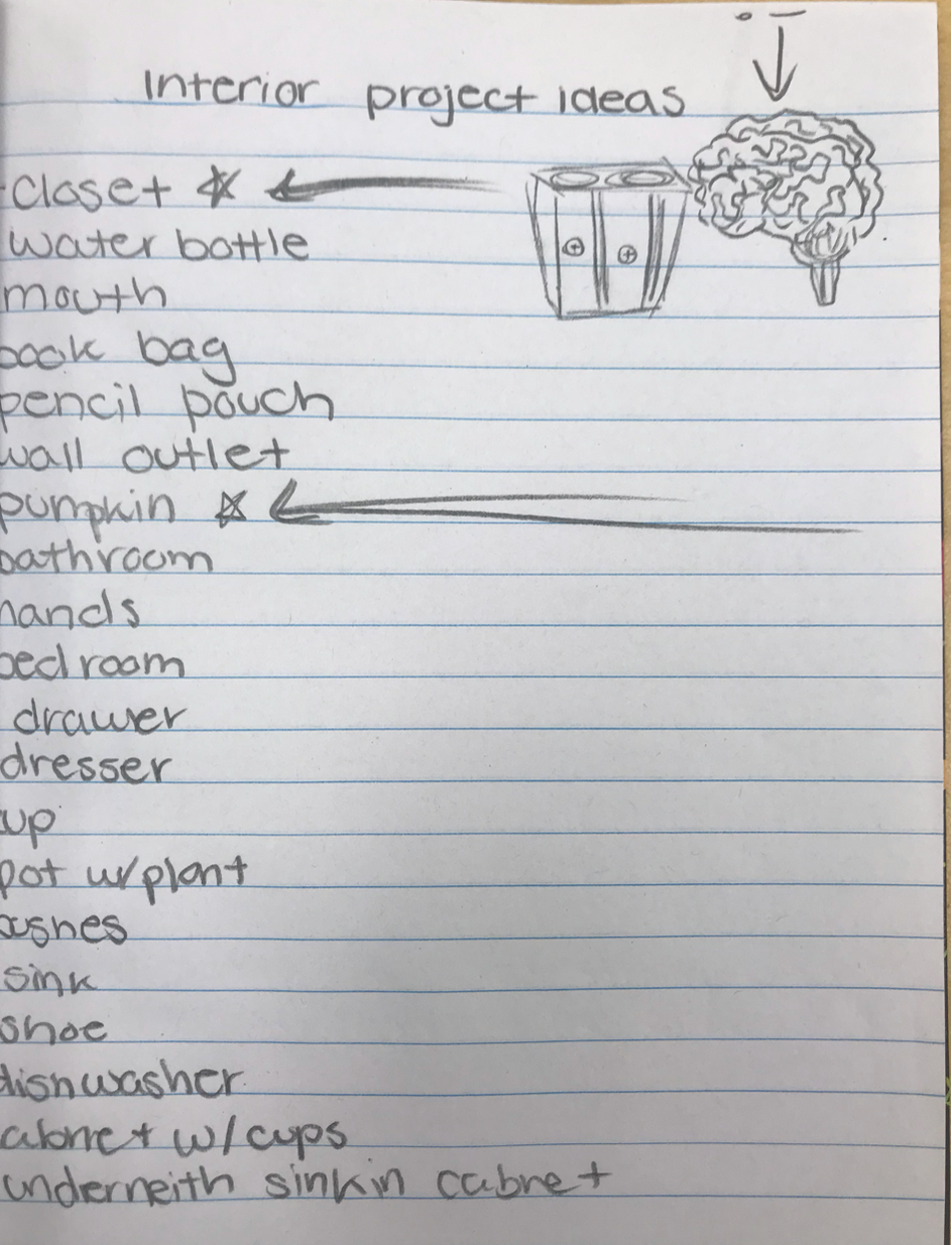
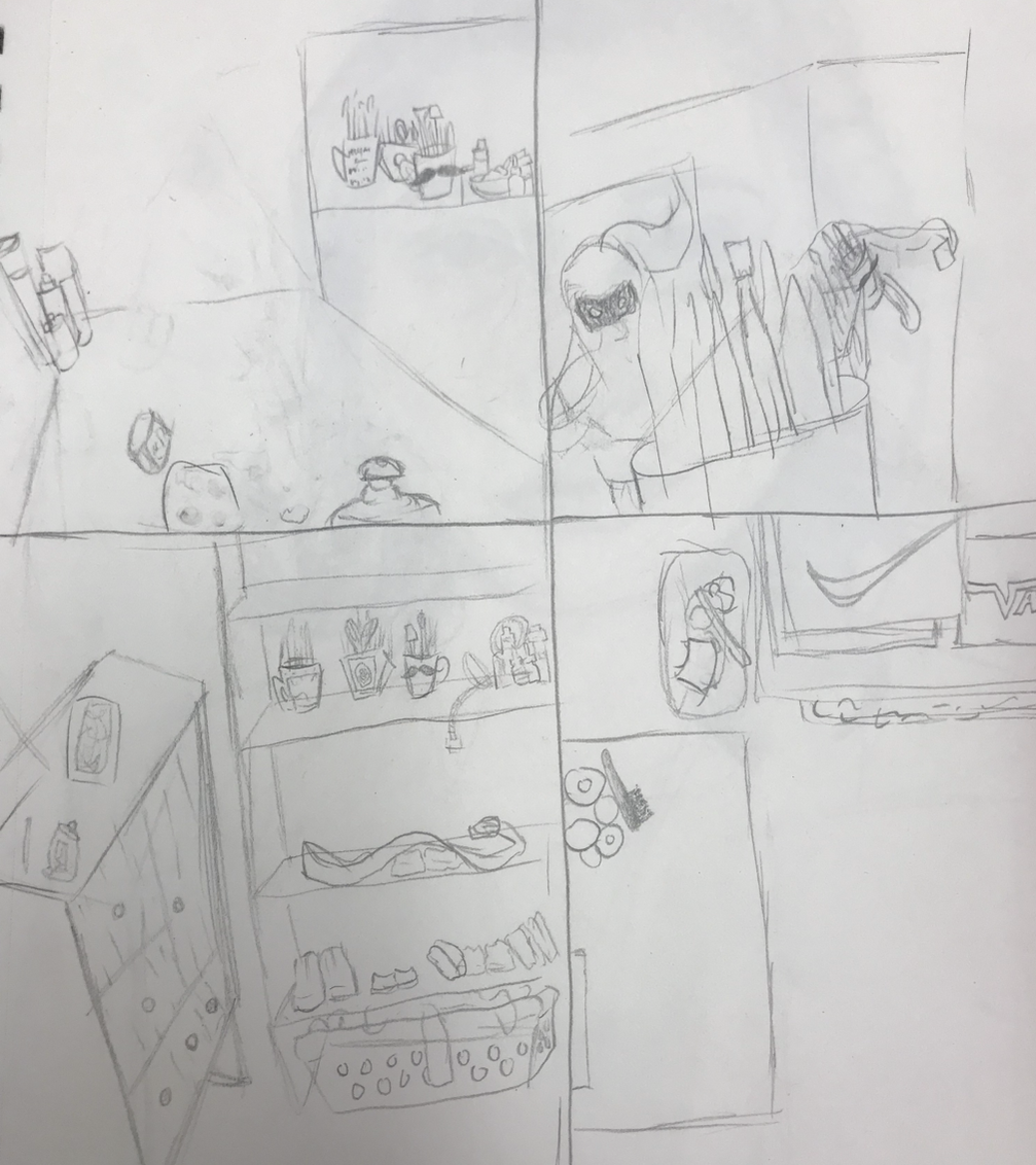
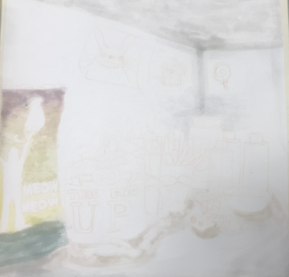
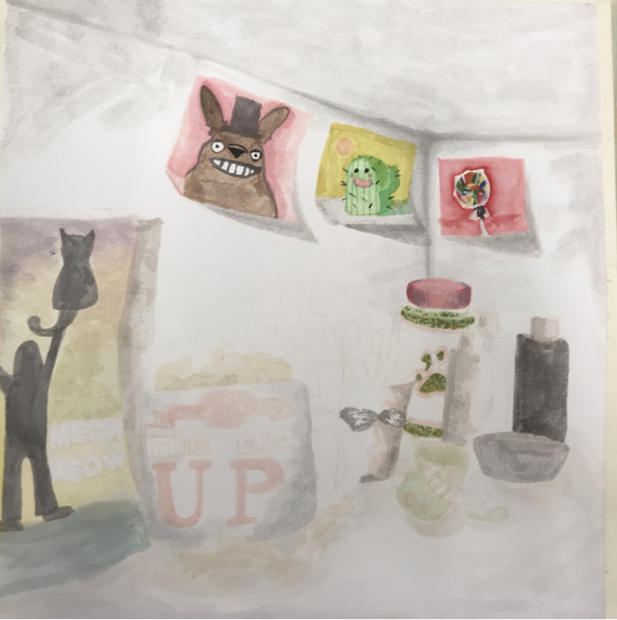
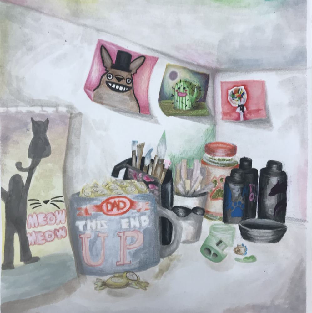
Interior Spaces
This piece i wanted to do the inside of my closet because i have a shelf in my closet with so many cute little doodles and posters and stuff like that. It is a small shelf where i keep all my art supplies and hair dye so there is a lot of colorful things. i had a Deadpool poster where the "meow meow" painting is but i couldn't add it if i wanted to put it in my portfolio. This is a watercolor and Prismacolor piece i first did a few layers of water color to get some base colors and then added value with the Prismacolors creating contrast between the soft and darker colors. I dont do a lot of work with perspective so this piece helped me get a good feel of how to do it the right way. i dont think that it the right way but it still helped me realize that i need to plan more on these type of pieces because i didnt know what i was doing. other challenges i encountered was i was making some of the darker areas too dark taking away from the rest of the piece. Next time i should make a better color scheme.
Final Artwork
Interior Spaces Progress
|
|
|
|
|
|
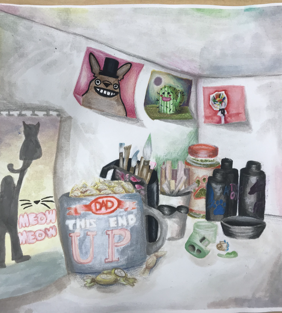
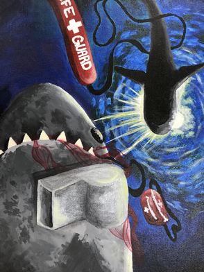
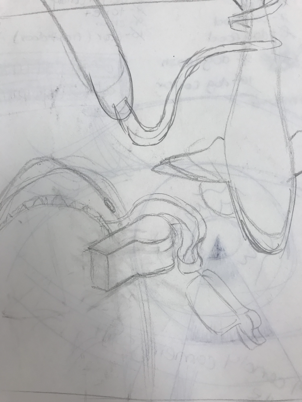
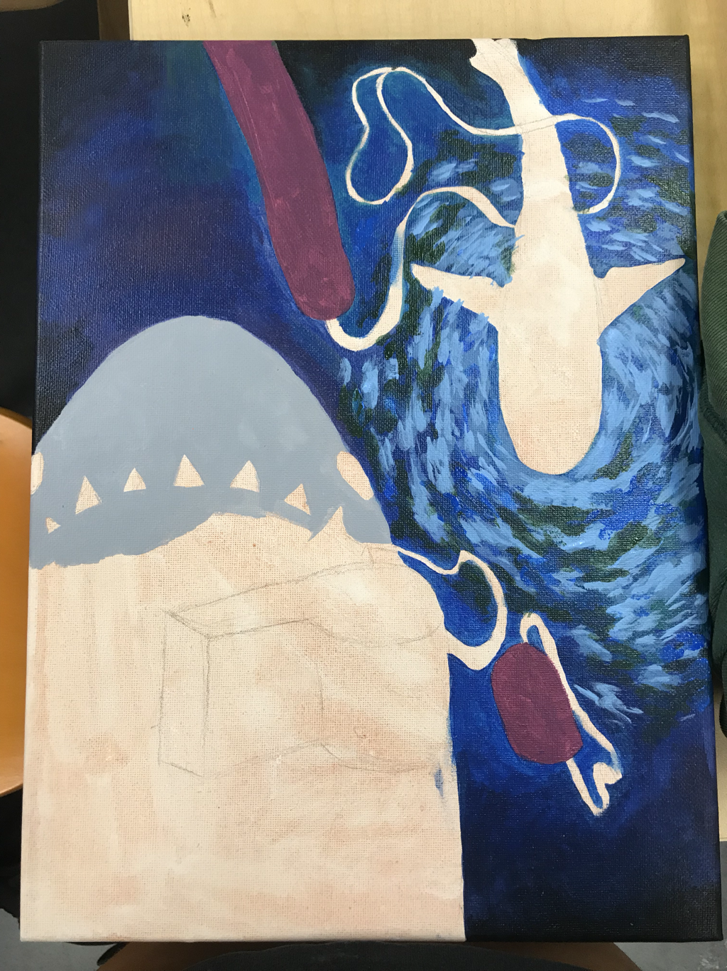
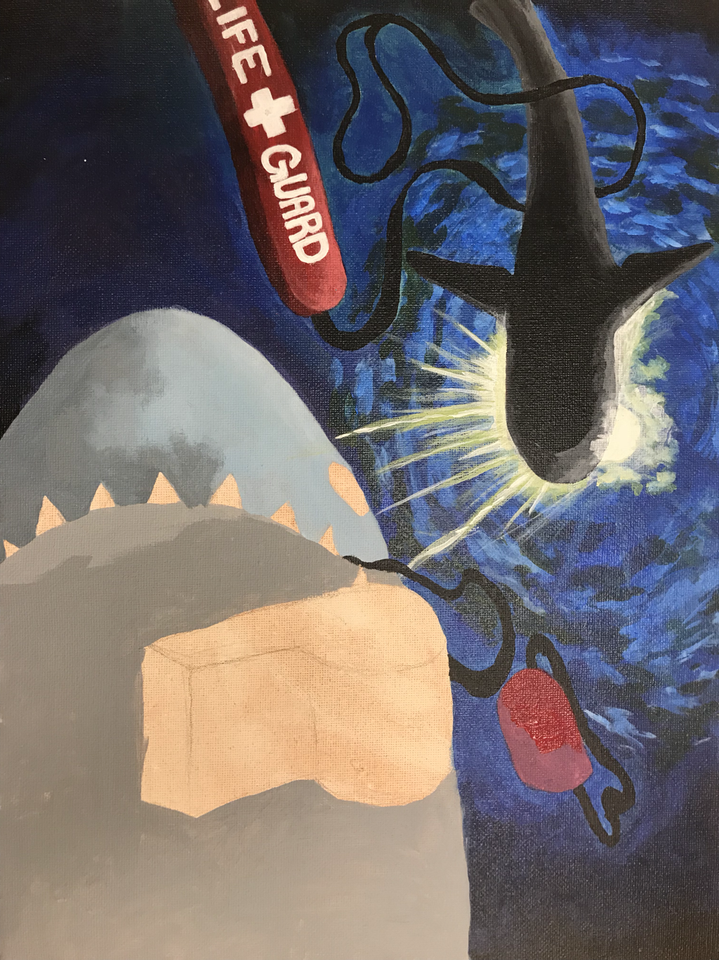
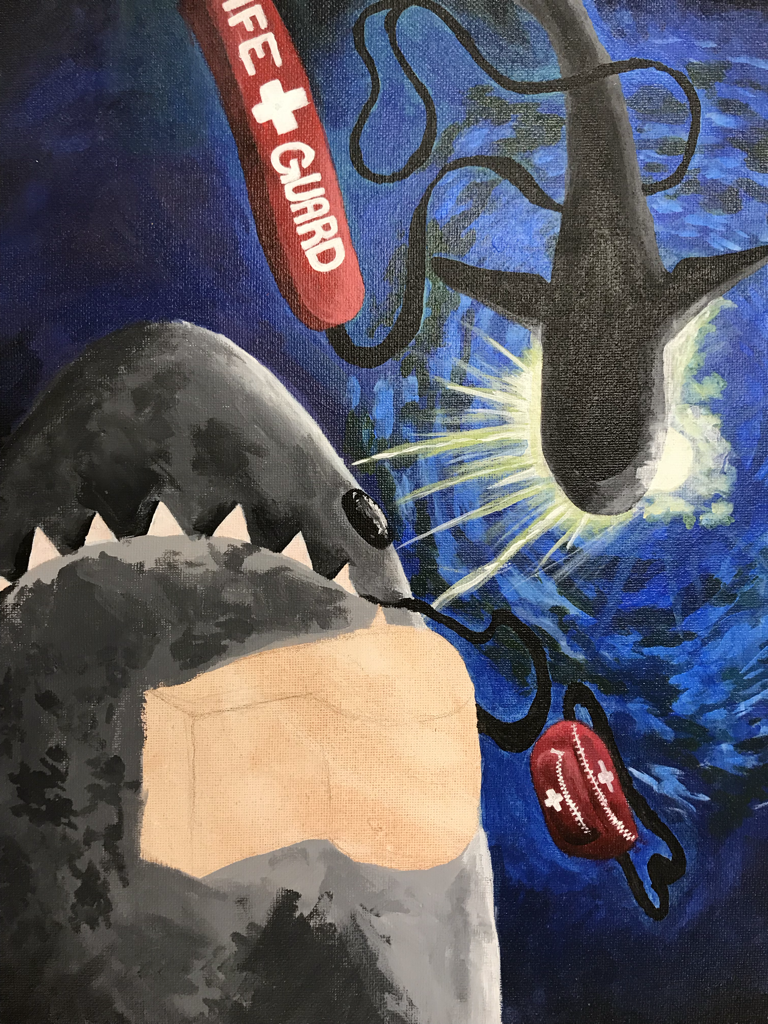
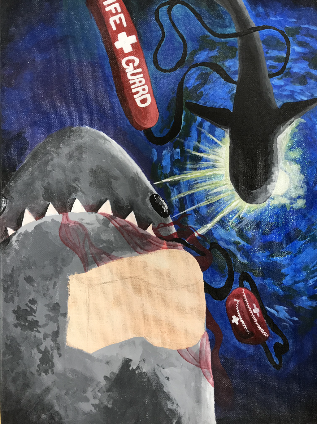
Everyday Objects
This piece is a 12x16 Acrylic painting. The thought process i had while planning this project was not very organized. I had the idea of lifeguard equipment came from my summer job working at a pool and i made it extraordinary by putting in in the ocean with sharks. I think this idea because i thought it was ironic to have something that saves people with something that kills people. I liked the perspective of looking up at the surface of the water from beneath the sharks with one in the sunlight to create silhouette on the shark in the background. I wanted my piece to look dark so i used a lot of blues and reds in my water and equipment. My process during this piece is that i started by putting down my base colors and working off of that adding detail moving to finer brushes. I added shading at the end because i wasn't sure where the light was going to be and how bright it was going to be. My learning experience through this piece is that I need to have a better color scheme plan with my pieces my color scheme with this piece was not planned at all and it was difficult for me to have a steady pace throughout this which made my time efficiency worse. This caused me to not finish my piece on time. My growth after doing this piece was very noticable, if you look at an acrylic painting that i did freshman year my colors were very flat and there was no composition in my piece, but on this piece i have a lot more flow, shading and composition.
Final Artwork
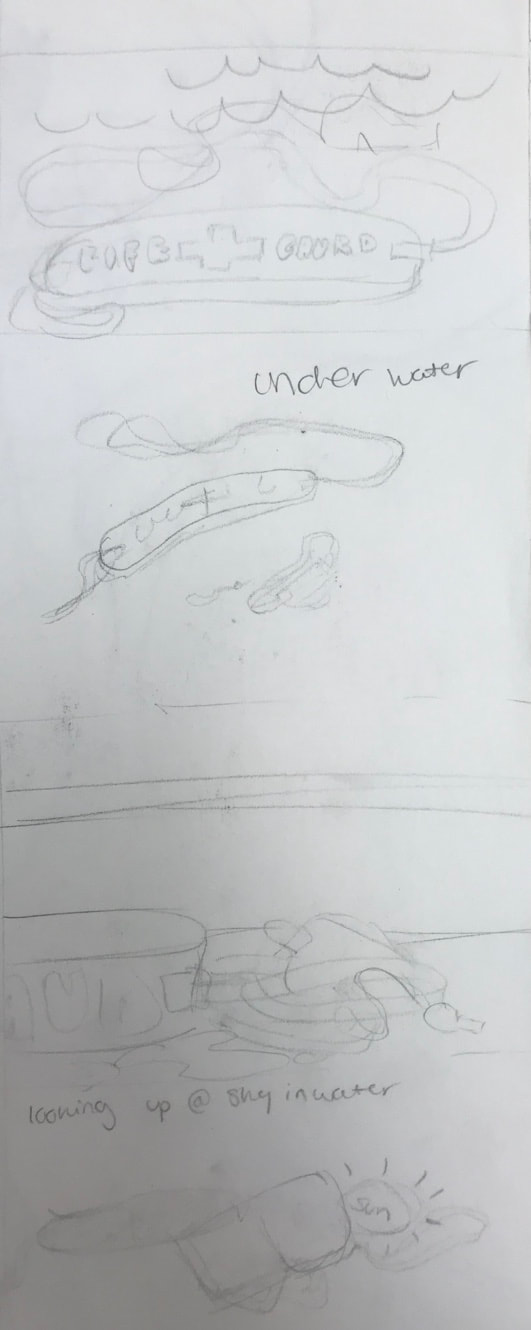
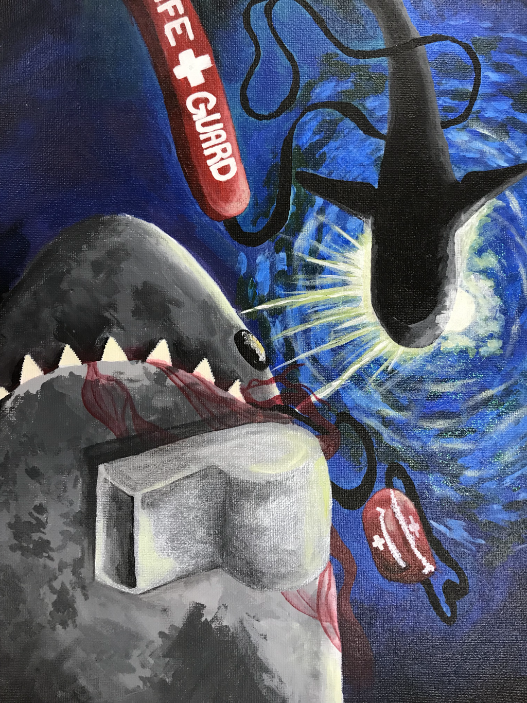
Everyday Object Progress Photos
|
|
|
|
|
|
|
|
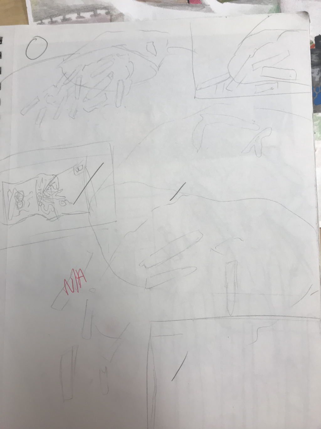
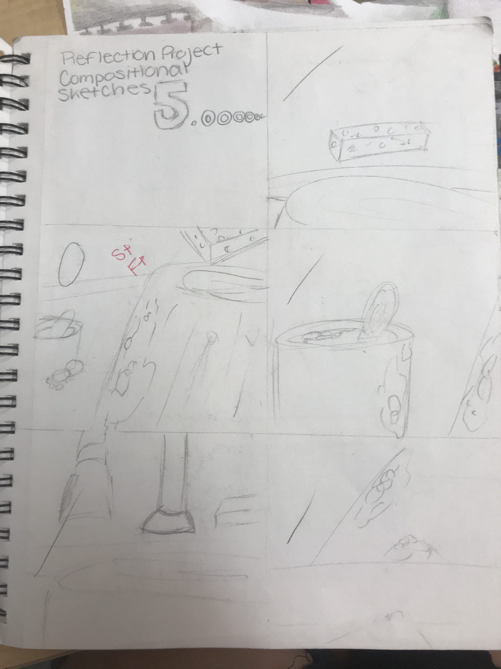
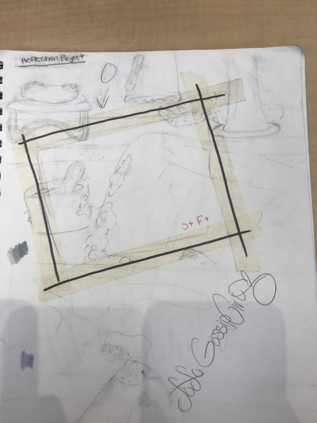
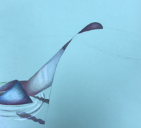
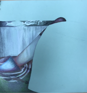
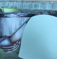
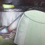
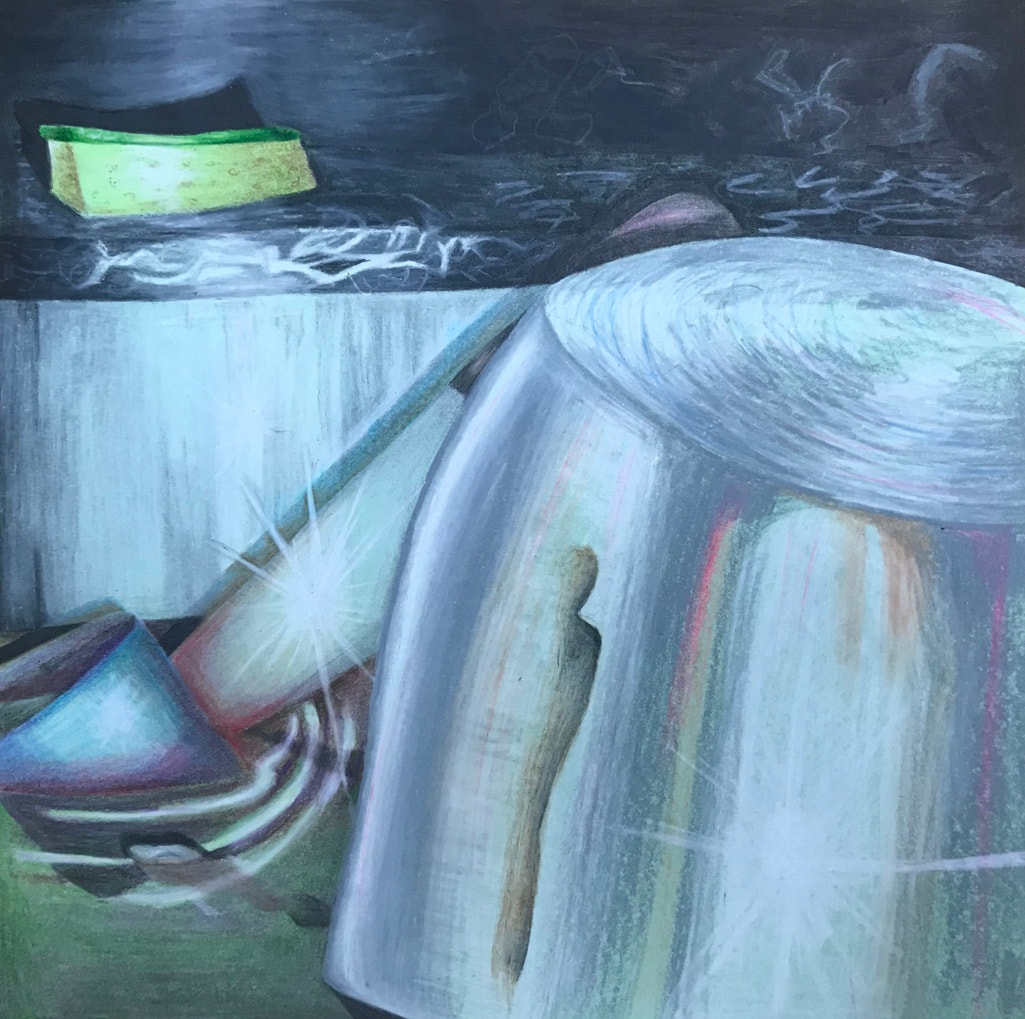
Reflections Project Final
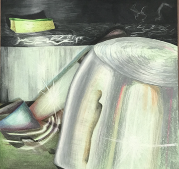
I brainstormed this idea by thinking of things in my house that were reflective. At my house my chore is to do the dishes everyday which lead to me spending a lot of time looking at pots and cups in soapy water. I wanted to add colors in there that were not usually on silver or water so i added some green and pink so make it pop more. i also made the pot in the front brighter so that the background could contrast with it and give the piece more value all together. challenges that i faced were that i had never done art that had a reflective component to it so it was difficult for me to adapt. I like color pencil as a medium but i had never used prismacolors before so it was challenging for me to learn how to blend the colors and still make it look good. i have usec regular color pencils plenty of times but they are very different compared to prismacolors. A challenge that i faced during this is that i didn't know how to highlight the ripples on the water look transparent and realistic. i was successful in getting the colors that i wanted for the cup and the knife in the sink. This helped me grow as an artist by teaching me how to get the textures i want by layering and by the way i stroke my pencil on the paper. i also really like the sparkles i did on the knife i think that made the picture cleaner.
Reflections project progress
|
|
|
|
|
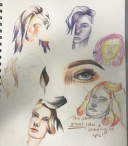
Philosophy in Art
My philosophy in art. I make art because I feel like I can turn things into how I want to see them, and getting better at something I enjoy gives me so much pride and joy. The way that I plan my pictures is i almost always draw from reference to give a rough sketch then add my own details in that I like. Things that I am trying to accomplish in this is I want to eventually be able to almost perfectly recreate a picture. I do not have a certain style. Most of the pieces I have created in the past are either sketches or drawings with just pencil. I don’t lean towards any of the fancier things like painting or colored pencil but I have before. When it comes to inspiration I stick to just simply images online. When I see something that catches my eye ideas start popping in my head forming an vision which I use for a rough sketch then I just keep adding to it till I get a result that I like. I wouldn’t say I have a style because majority of pieces I do are copies of references which are mainly portraits of people or animals Which I would say is my strong suit. If I were to pick my biggest inspiration is instagram in general because I have access to practically unlimited images of different aesthetic pictures such as professional photos of models or drawings by other artists. I have taken pictures of my friends and family and drawn them too. I also like to draw things that I think are beautiful and make them dark. Turning them to look gory, bloody, and satanic. I like doing this because it gives sort of an intensity to the image and I think it is just a cool twisted perspective on beauty. In my art I want people to understand that I create all my personal work for myself and to speak to me. I do what makes me proud I like seeing how I grow in my art and feel good about what it’s come to be.
