Victoria White
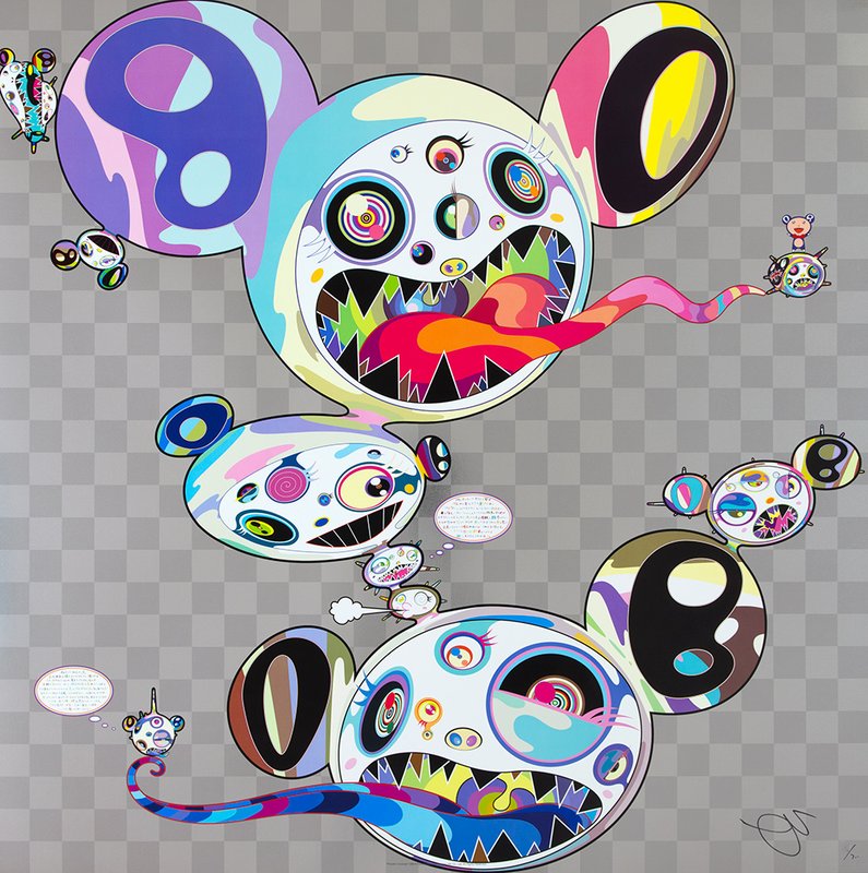
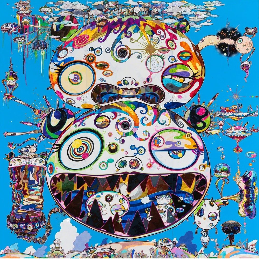
Rossi Art 2 14 May 2018 Alexander Rodchenko was a Russian photographer and graphic artist. Most of his more famous pieces were paintings and photographs. The photographs which were in black and white. Two words that I would use to describe his art is edgy and or aesthetic. In his graphic designs, he used a great variety of colors. Takashi Murakami is a Japanese Contemporary artist. A lot of his art is very repetitive and colorful. Also, there are a lot of pieces of his that consist of cartoony looking characters. In his art, he uses a lot of thick lines and flat bright colors. For my artist, I chose Takashi Murakami. He designs the ideas, but doesn’t actual make the art he hires people to paint, graphicly design and print his art. He uses colors that pop together. He makes modern art it is from our time. His more popular art is more like smiley faces and mouse looking things that have many bright colors. Some of his other art is darker and less bright and is still made up of the same shapes just with more details and shading. Takashi Murakami has interests in animation sculptures prints fashion and paintings. 
|
|
|
|
|
|
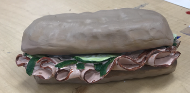
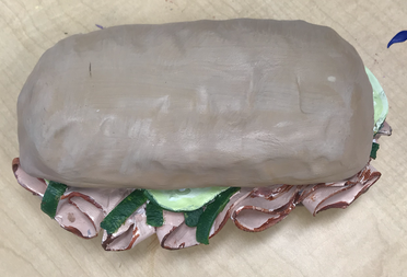
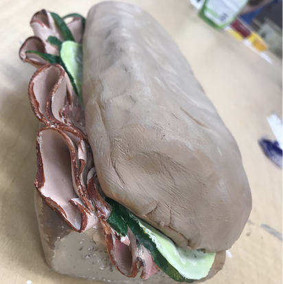
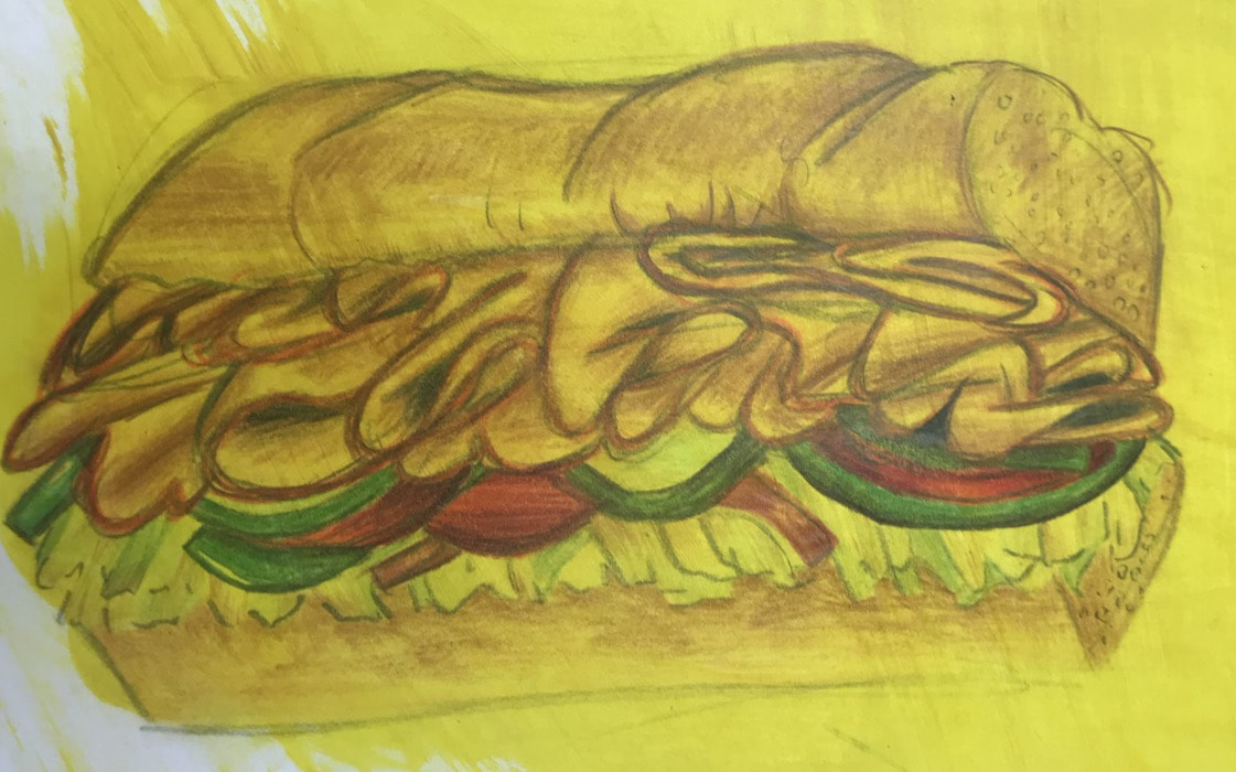
- I think the craftsmanship is really good the bread isn’t as realistic as I would want it to be but I think that it is still good. I think that it is pretty neat and it looks like an actual sandwich.
- The most difficult part was to get everything that I wanted to be on it like the vegetables and the amount of cut meat I wanted on it. Getting everything to look like it was the right size was also hard.
- Yes because they are the same colors as a real one and they are really bright so they catch your eye a bit.
- No i think that it is good everywhere except for the back but there wasn’t much that I could do with a sandwich.
- So constructing a sculpture you have to think about how it looks from more than just the front angle.
- I created the textures on my sculpture by using a sponge.
- Yes my sculpture does look like the actual food. I have a lot of experience with sandwiches so I was able to figure out how it should look from my own personal experiences.
- If I were to do this project I would add more texture to the exterior instead of worrying about the smaller details the whole time.
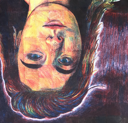
- I think that my portrait is neat and well executed but I don’t think that I the color is very accurate even though It did come out well.
- I had a lot of trouble with the red because it really is an overpowering color so It was hard to tell how dark it would be when I blended it
- I did follow those directions except for doing the lips and the eyes because I wanted to make sure that they would be in the right spot and be the right size, I had to redraw the lips probably around five times to get it right. It is important to do it box by box because then you can rally focus on how to make the color you see and placing things in the correct place.
- I created value by layering all the colors to create a dark brown/ purple color
- Well it was difficult because you get the exact color that you see but you can get pretty close but I was able to get the colors close enough to look realistic as a whole picture
- I could improve my portrait by taking more time to test out how to make certain colors and shades with the three pencils
- I do think that I was prepared but honestly not because of the previous lesson but because I am experienced in using colored pencils and portraits so it was easy. But I have never used prisma before so it was cool to learn how to use them instead of regular colored pencils
- (finish after critique)
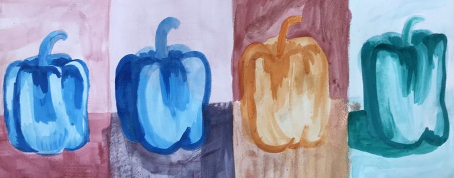
for every pepper i did a different strategy. the first one i did all cool colors and the second one i used salt and the third i used collred pencils and the last one was monocramatic
|
|
|
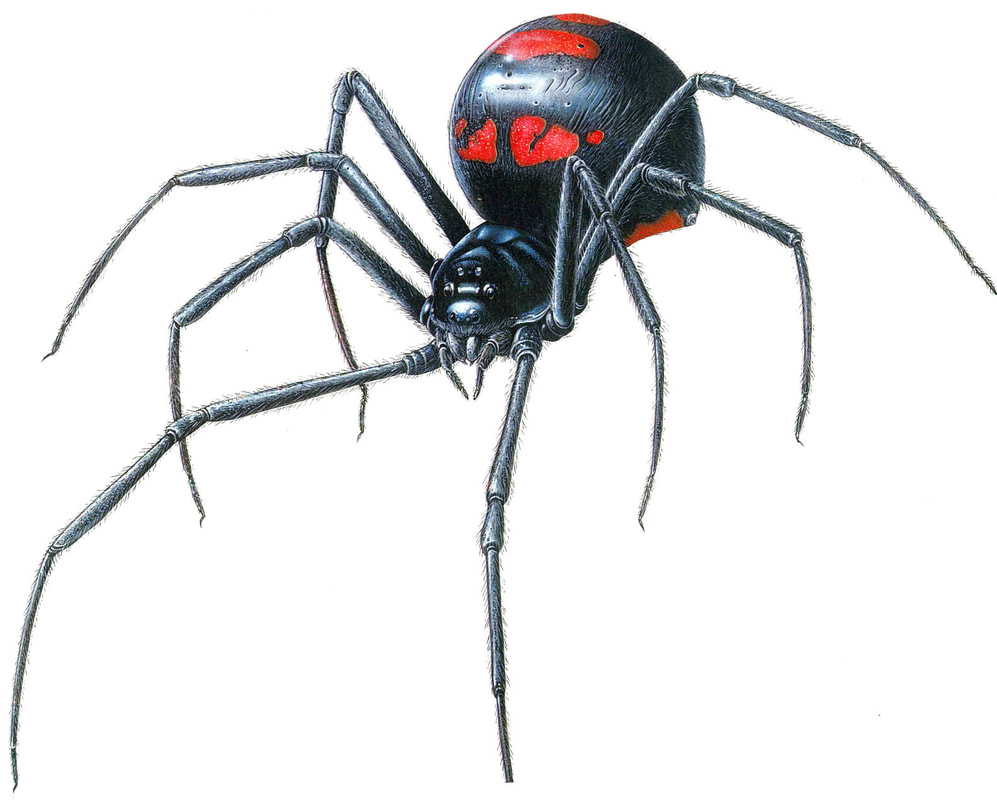
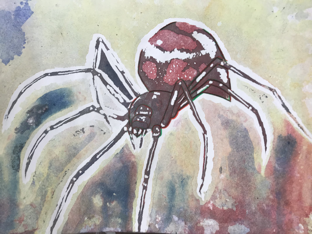
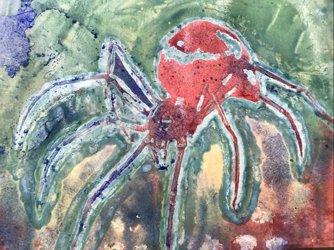
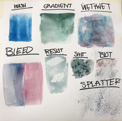
- The process to do this project was that I had to sketch out a picture and I chose a spider, then we had to take masking fluid and cover the places that we wanted to keep as white then let it dry and spray water on the paper and put drops of color all over it and let it spread across the paper till it’s the color that we want then to let the excess drip off the sides I let it drip onto the paper towels and use the blow dryer to speed up the drying process. Once the paint is dry we add another layer of masking fluid to preserve the color. This process is repeated until we think that we are done then we peel all the dry masking fluid off the paper and I touched up some of the parts with the water color pencils.
- Some of the difficulties were that I wasn’t sure how my piece was going to end up at all until the end when I peeled off the dry masking fluid and even then I wasn’t happy with how it ended up so I touched it up with colored pencils. There weren’t any black or brown colored pencils so I used a mix of red and green to get the dark color that I wanted.
- 4 things that I learned during this project, well first I had never even heard of this kind of water color painting. I also learned how to use masking fluid and would like to use it in other ways because I know that there are more than just that use for masking fluid. I learned how you can layer different colors to get a whole other color (green and red to make a dark brown) and I learned a lot more about water color as a whole because I don’t use it that often to really acquire skill so this project taught me how to use it to make texture and shading right.
- I think if I were to redo this project I would take more time towards the end to do some of the more smaller details and make sure that I paid attention to how dark some parts would be.
- I layered green and red on the body to get a dark brown color and I thinks that it made my piece very successful, more successful than what I would have thought it would have been. With this project being my first poured water color painting, I think I did a good job.
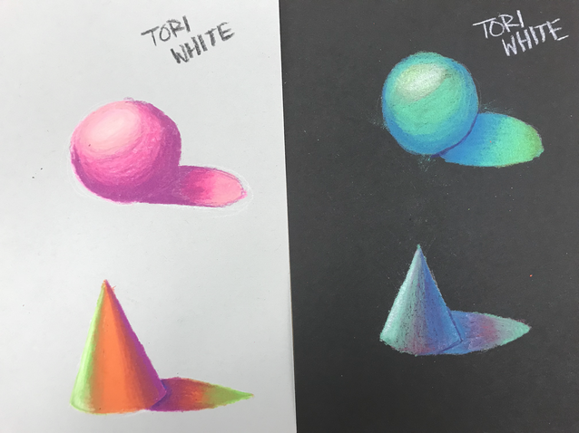
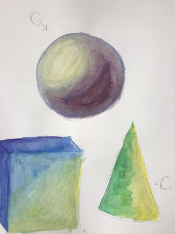
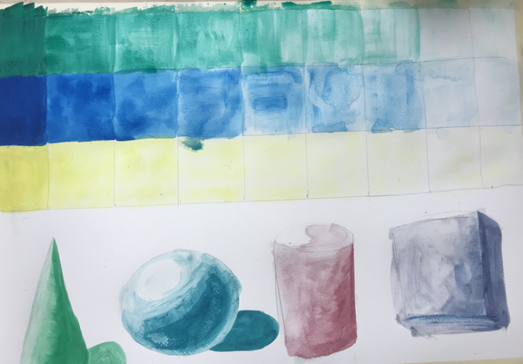
- I don’t think they helped because they were pretty basic shading lessons that are really straight forward and common sense. These lessons were things that I already knew how to do and they were not detailed at all I didn’t learn anything about texture because we were painting basic shapes like spheres and cubes.
- Having a guest artist visit was beneficial because he is a professional and he knows what he is doing when he does poured water color paintings better than any of us and he explained how to do it really well.
- He made me understand that if you are good at something and you enjoy It that it is something you might want to invest in getting better at and pursuing a career with it
|
|
|
|
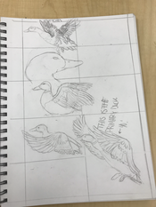
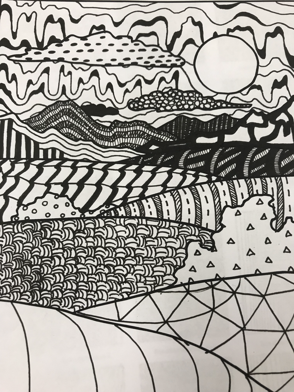
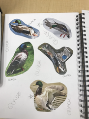
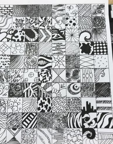
1.) The way that i organized my composition was so that there would be different textures and shades for each part, and i wanted the different sections to be distinctly different and catch your eye every time you look at a different section. i wanted there to be really small details in some parts so that you have to look really hard to see the actual design within another. i tried to contour the designs to the shape of the picture making it pop a bit more. i think that it was very successful, i like how it all turned out. when i first started though i didn't think that the designs that i chose were going to go together or flow the way that i wanted it to. it wasn't exactly how i wanted it to turn out but i am still happy with the final product.
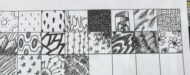
2.) The texture and patterns are important because they are what is going to shape the picture and give it dimension. i like when my pieces flow well, and when i say flow i mean that i want each part of it to visually support another.
3.) The values are important because to make you piece stand out the eye it has to pop out rather than be flat and lifeless. when a piece has good value it has shading that makes each part stand out, gives dimension and shape. On the stomach of one of my ducks the edges are going to be darker than the middle to show that it is round.
4.) I think that overall i did a good job making sure that my project was neat. the lines were very thick so it did help out a lot when i would mess up almost covering up my mistakes. i think that all my lines and patterns were neat. i took my time with every part and i think it came out really well. the only part that i think i could have done better on was on the duck on top, on its head i had a faded out design of spirals that slowly got smaller as you got higher on its head and i think i could have slowed down more when i was drawing the smaller spirals on the make them look more circular.
5.) i think that i learned how to make every pattern neater by controlling my hand. i definitely was less neat when we first practiced the different values.
6.) to create a good pen and ink piece you have to plan every stroke and i didn't realize how important that was until i practiced for a while. i learned that you also need to take your time and make sure that its all neat.
7.) i think that this project will help me later in my art future to take more time for precision and plan ahead to finish with exactly what i wanted. i also think that this project help me use more of my imagination to think of designs.
8.) i would have taken more time to sketch it out how i want it because i wanted my piece to be more realistic than it turned out, it looked like something you would find in a children's coloring book and that is not at all what i was going for.
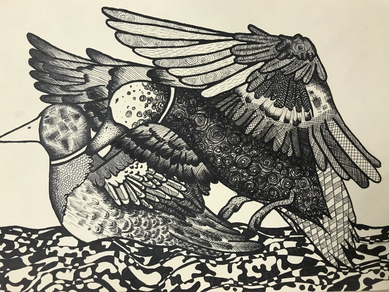
I tried to make every pattern and design to fit the general shape of each section. I tried to make the farther layers darker.
|
|
|
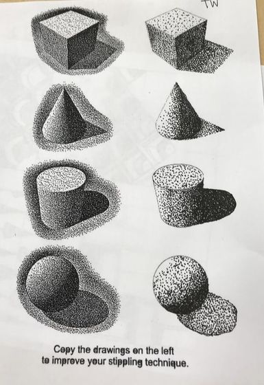
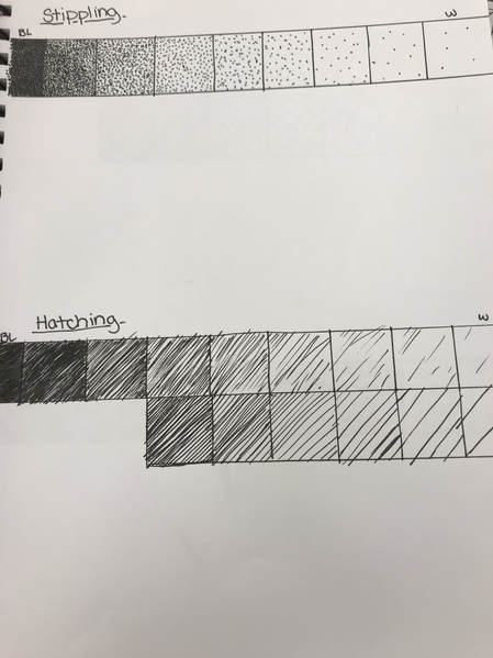
stippling worksheet
I followed the shape of each shape to make sure that i put the sading in the right spots to make it look cleaner. i put the dots really close together to create a darker shade and spread them out more to make the shading lighter.
pen value chart DP post
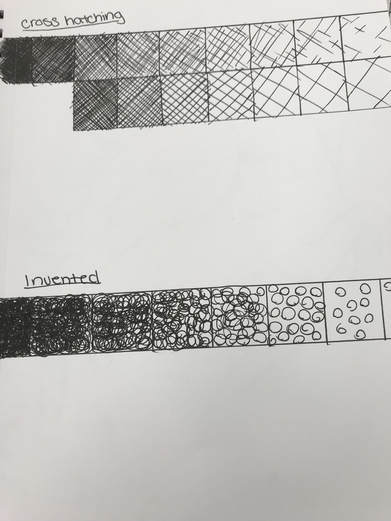
for every kind of texture i made evry mark closer together to create more of a dark shade and farther apart for a lighter shade.
assessment drawing portraits
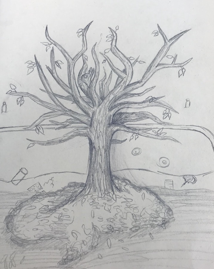
i started with a general shape of the tree and I worked more lines in and kept adding more detail then put a background in.
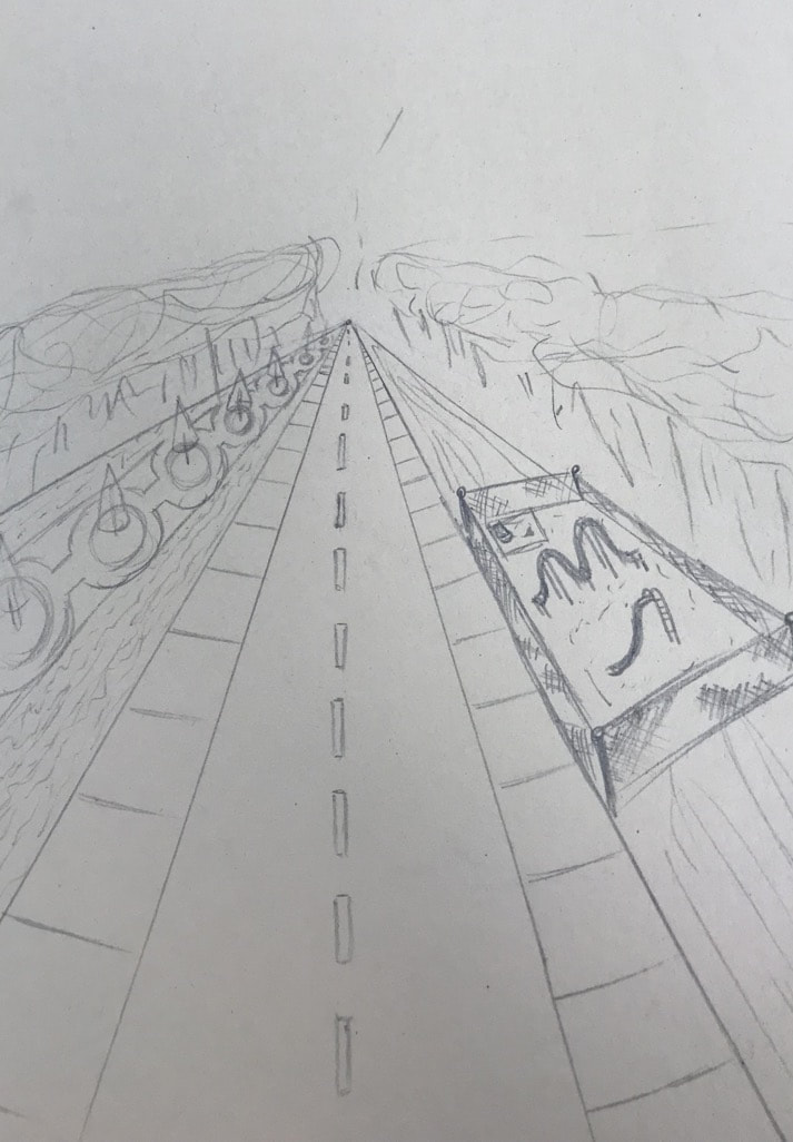
For my one point perspective portrait i thought of my idea and how i wanted to picture to look and i figured out where i wanted my vanishing point and began to draw my lines. i added more detail trying to keep everything proportional.
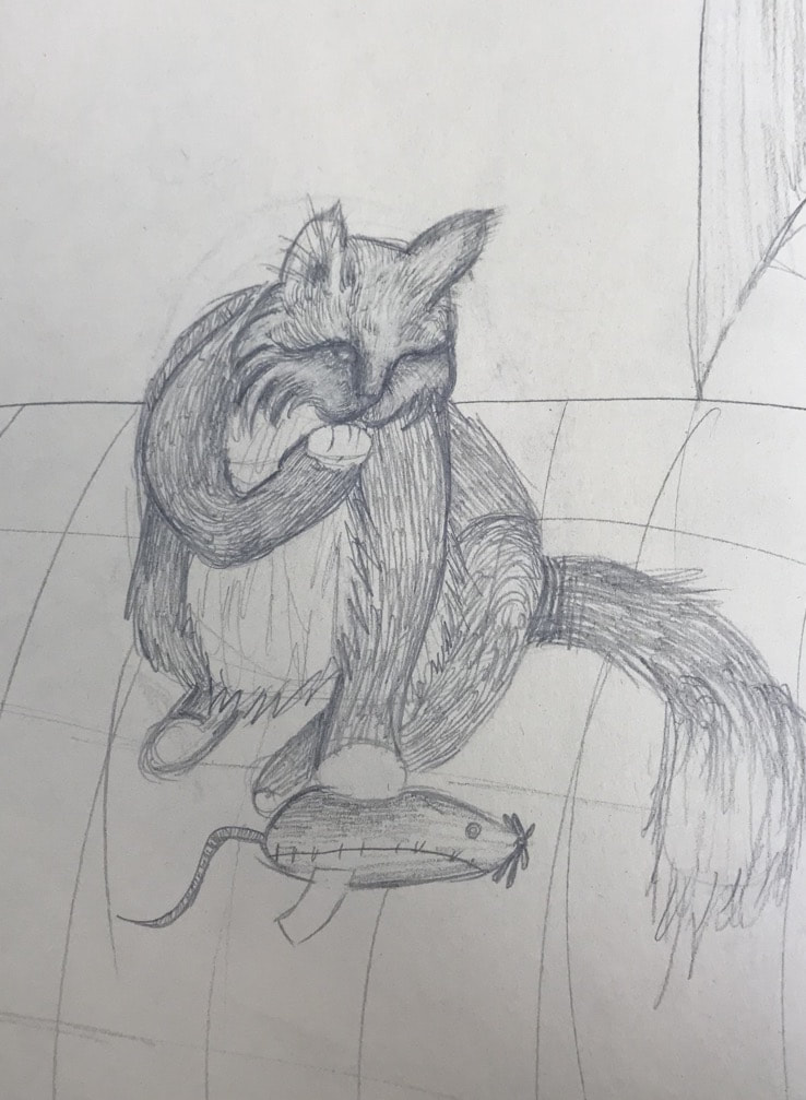
I made a big oval in the center of the paper and a smaller cirlce above for the head and made all the limbs. I slowly added more detail and texture throughout its whole body.
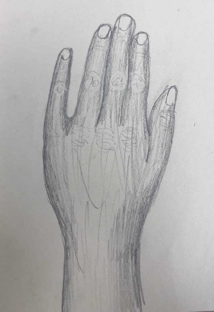
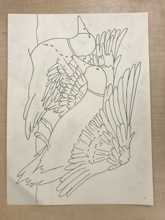
I made a general shape and added fingers then added more detail and shading trying to keep it proportional to my hand.