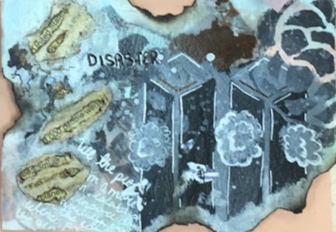
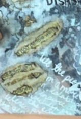
i used 9 different mediums and techniques all together, including tissue paper, pens, water color, acrylic, print paper, burning, bubble wrap, and sticky peel paper. The tissue paper was glued onto the postcard as the background, the pens I used to outline the buildings, draw the plane parts, and write the words on the bottom left side of the post card. The water color I used to stain the printed paper with a 9/11 article printed onto it. The acrylic I used to paint on the towers and paint over the sticky peel paper stencil. I used the print paper to look like burning news articles on the post card. I burned the edges because I wanted it to look like it came from the wreckage. I used the bubble wrap to make a smoky cloudy texture in the background. And I used the sticky peel paper to create a stencil to make the smoke coming from the towers. My word was "Disaster" I used the 9/11 attack on America because that is one of the most common modern thing that people think about when they hear "disaster".
0 Comments
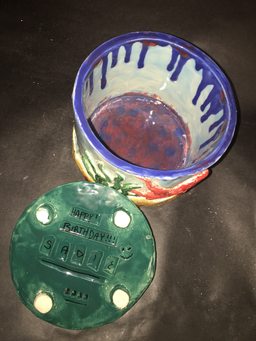
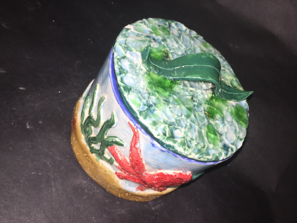
i am going to take it home. I might add some acrylic to it because there are some areas that are a little spotty with the glaze. And I also plan on gifting this to my friend for her birthday. Something that i found to be very difficult was the sandy texture on the clay at the bottom of the pot. It was difficult to get a realistic texture to actually look like sand. I think that it didn't take a pong time to put together, I expected there to be a lot more work required to finish this piece. I started out with a slab of clay large enough to wrap around a plastic tube about three inches in diameter to make the sides of the pot. I smoothed out the edges to make it more sleek and I started to the bottom of it with another slab of clay and cut out an out line of the bottom of the pot to make a perfect fit. Then I scored the slab and added water to connect the two pieces. I then began to make the smaller pieces of the piece like the sea-weed and the fish. When I finished all the pieces and put them on the pot, we fired it. It came out with no breaks, then I glazed it and fired it again. Came out once more with no breaks or cracks. Then I added broken glass to the top to make it more aquatic feeling, and it came out of the kiln with the handle broken and I used superglue to fix it and took my finger to smooth out the excess glue to make it less visible. 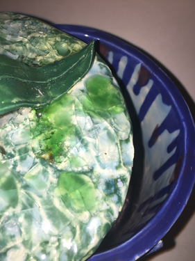 i liked the acrylic the most because i think it turned out to be the best and alsp it was pretty easy and my least favorite was the water colors becuase uf you messed up it was hard to recover from.
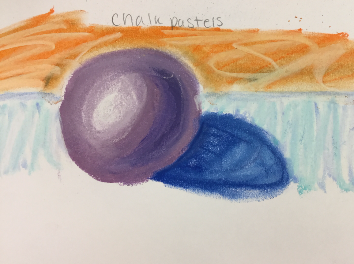
  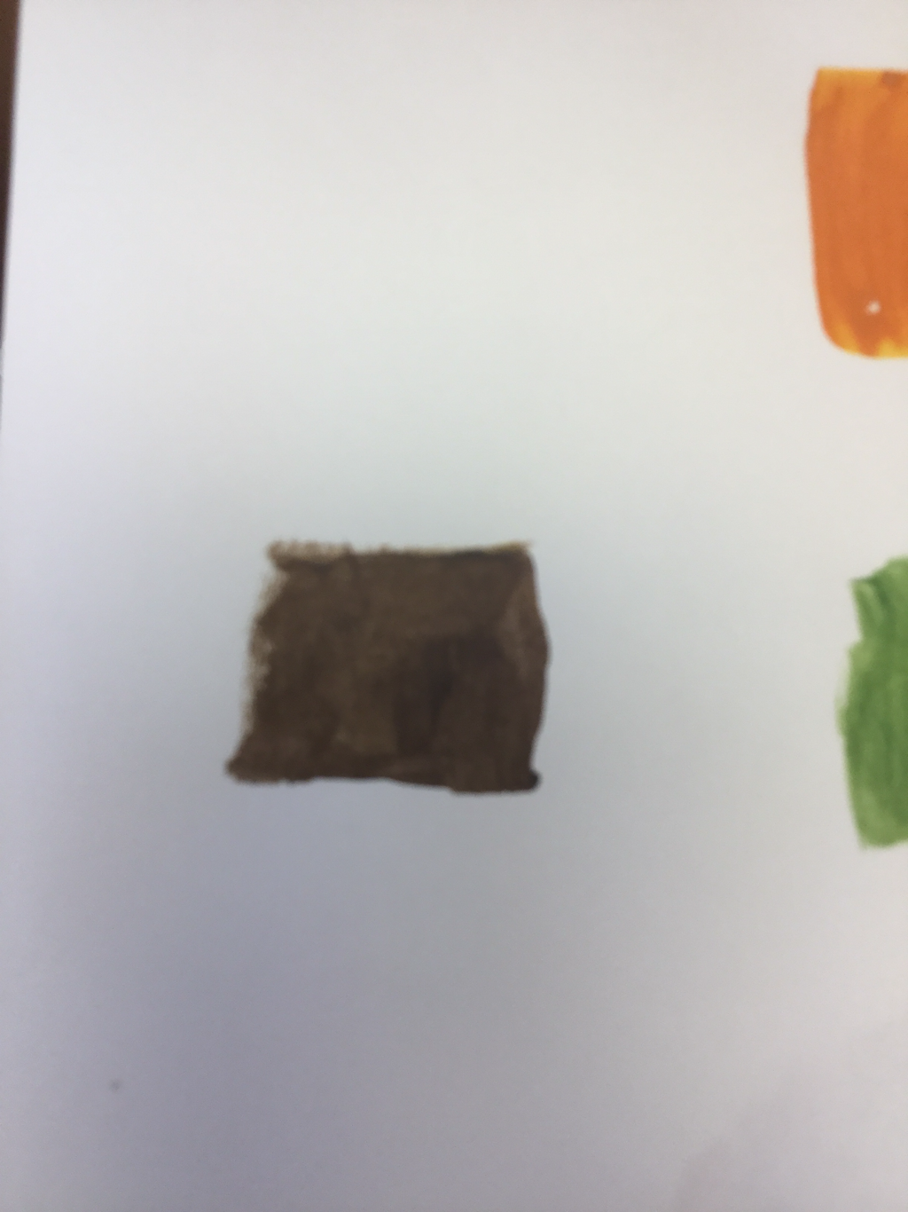  Mixing the color swatches was very hard at first because of the lack of experience in mixing different colors to get another. It was hard to get even close to the colors, took a long time and i ended up restarting twice before I thought it was even close to being acceptable.
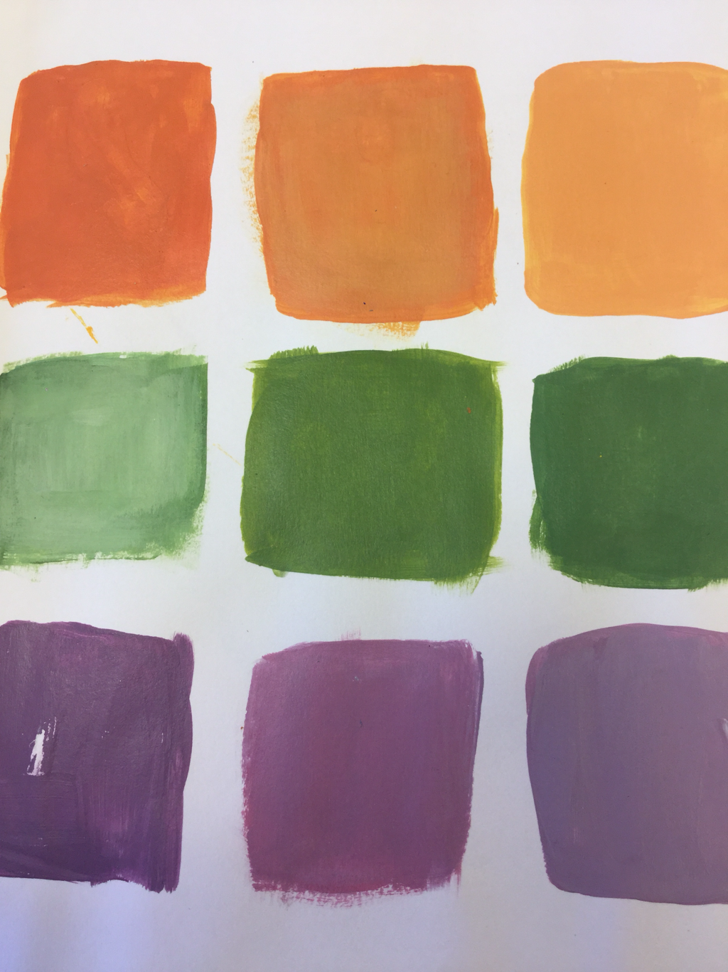
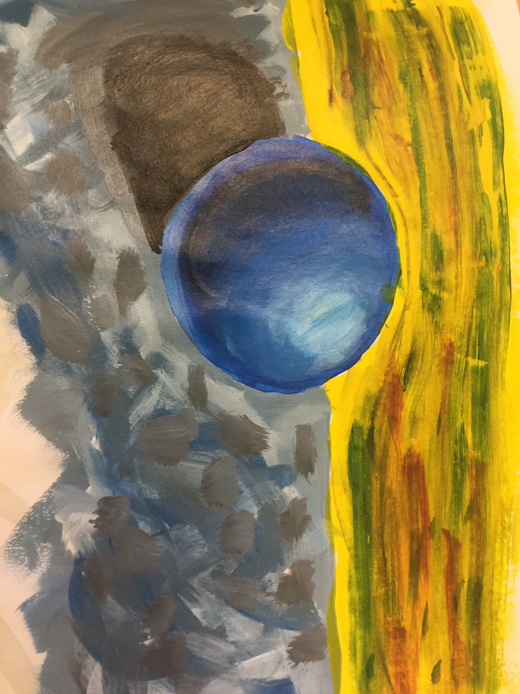
After doing to paint project, mixing colors was a lot easier because for two weeks that is all we did. So yes, mixing the paint to get a brown was fairly easy. The picture i picked to paint was a picture i took of my sister 4 years ago at the beach. Ever sinse i took it i really liked the picture of her. Very asthetic in my opinion, i think she looked like a model and i look up to my sister, and the photo had different shades, so i thought it was a challenge and the perfect picture.   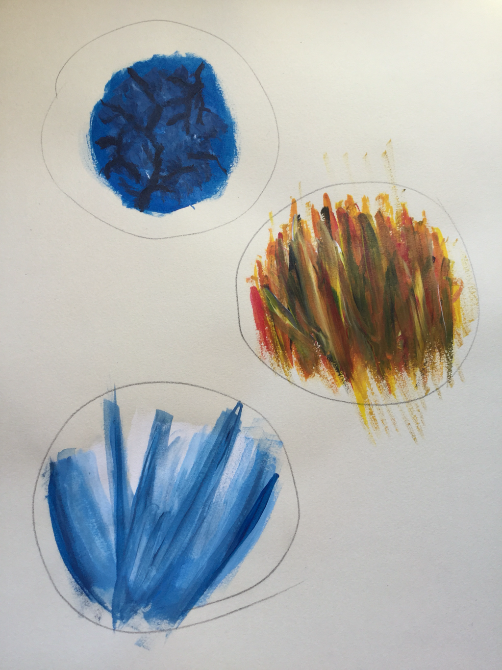  that warm uo helped me the most because i am the least experienced in painting so learnimg how to do the different textures was very helpful especiall before the painting project.
pros and cons, i could have taken more time on all of them but the pros i think that they turned out way better then i expected them to. I think that they look very nice and i can see that i am gaining a lot of skill from this class |